POOR DESIGN
Liquidation Land in Phoenix AZ | Lowest Priced Bin Store in Phoenix
Overall Design:
Ranking 1 out of 10
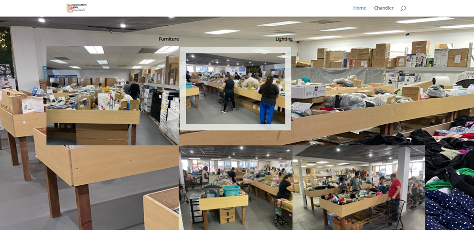
This website is extremely cluttered. There are pictures on top of pictures, none of which are of good quality. This is a liquidation store so the things for sale are cheaper and not as nice as a department store, but the site looks like a scam. The colors chosen for the logo are not appealing to me and the entire layout of the site is very unattractive. Lastly, the text is inconsistent considering that some paragraphs are completely bold while others look very small.
Navigation:
Ranking 1 out of 10
There are only two-page options available on the site which are both listed at the top of the website. That is relatively easy to find, but the process of shopping and purchasing items is extremely confusing. The last thing that I noticed is that the search bar is easy to find because it is right at the top, but it does not work. Typing in simple search words of products shown on the home page only brings up a different page of what looks to be posts made by the website owner.
Functionality:
Ranking 3 out of 10
This site allows the user to look at pictures of what the liquidation store offers, which is helpful when you are wondering what the store sells. The purchasing process is still confusing, and I doubt anyone would make a purchase on the site. It is hard to figure out what is what due to the fact that there are no labels which makes browsing very difficult and frustrating.
Content Quality:
Ranking 2 out of 10
The content on this site shows exactly what the inside of the actual store looks like. While it is truthful, it also appears very unorganized and chaotic. Because of the overwhelming layout of the pictures, the quality of the content looks remarkably poor.
Site Effectiveness:
Ranking 2 out of 10
The website allows you to see some of the things that the store has to offer. While the purchasing process is very hard to figure out, this could drive in-store traffic. The only thing is that the clutter of the website is very likely to turn users away immediately.
EXCELLENT DESIGN
Wholesale Liquidators | Liquidation Auctions For Inventory Resale | B-Stock
Overall Design:
Ranking 8 out of 10
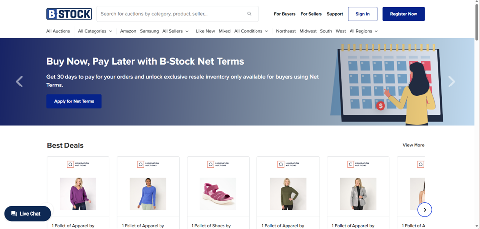
This website is very neat and clean looking. The colors complement each other very well. The pictures look professionally taken and of good quality. The site draws your attention to the products for sale in a way that is not overwhelming. Also, the banner at the top is very attractive with photos shuffling and new information to see.
Navigation:
Ranking 9 out of 10
The navigation at the top of the page is very clear. There are several descriptive options to look for different products as well as see the different pages available. Figuring out how to get started is very easy due to the “Register Now” button located at the top right corner of the home page. These features all make the navigation nice and simple to use.
Functionality:
Ranking 10 out of 10
The site is very easy to use because it allows you to see so many products very easily. Browsing is easy to do, and purchasing is relatively simple as well. Finding the things you need is not difficult and makes the whole experience a lot nicer.
Content Quality:
Ranking 9 out of 10
The content for this site is very well organized, and the pictures are all of good quality. It is easy to tell what you are looking at because there are labels and information available for each product. The font is all uniform and very neat, making the site look real and trustworthy.
Site Effectiveness:
Ranking 9 out of 10
The top of the page makes you interested in the site as soon as you see it. The shuffling, neatly taken pictures are of good quality. The navigation is very easy to use, which makes the site so much more appealing. Because of its good functionality, this site is bound to make more purchases than the previous site.